Stormgate Releases Its First Ever Gameplay Footage
The direction looks great so far
Stormgate, an upcoming RTS from Frost Giant, released its first-ever public gameplay footage today. The game is still in pre-alpha, so it’s tough to say how much of today’s presentation will resemble the final product. I found it impressive, though, thanks to a number of directional details. Below is some color and my thoughts on today’s show.
Disclaimer: I watched the private Stormgate Summit presentation a couple weeks back. Nothing in this article is confidential information. I didn’t sign an NDA.
Graphical Style
Stormgate looks to be adopting a clean and readable graphical style, with warm colors and just the right amount of cartooniness. Here’s an example asset from Frost Giant:
I think the art style Frost Giant is showing here will prove to be durable. For example, I think the below will age well, and looks excellent:
By comparison, I find overly realistic graphical styles to age poorly, such as in the case of Grey Goo’s interstitials. (Ironically, Stormgate’s gameplay footage reminded me a little bit of Grey Goo’s Beta faction, including its use of concealed terrain in a forest area.) Even StarCraft II’s in-engine renders from the Wings campaign don’t hold up that well nowadays.
The game world feels vibrant; I liked, for example, the butterflies moving in the background or the resource the workers are assigned to shining and spinning in the air. A subtle thing StarCraft II did well in this area was its use of graphical cues to convey information, like displaying the silhouette of the in-production Stargate unit or adding shields to marines after Combat Shield is researched. I like how each of the buildings in the pre-alpha screenshots showcases a moving part, like a fan or a furnace or a conveyor belt. I also like how the gameplay footage highlights the buildings doing stuff when something is in-production, like the conveyor belt moving or the fan spinning. This sort of thing both increases the skill ceiling and makes the game feel more alive. I’m glad to see it making its way to Stormgate.
User Interface
Taken at face value, the UI is in the same general ballpark as many other RTS games:
Unit movement looks smooth; for example, the few seconds of units getting dropped by a dropship, or the dancing back and forth of early-game units.
Assuming this is an indication of how the engine works more broadly, these are the sort of advanced user interface features that it’s easy to get used to in StarCraft II but are not actually all that common. For example, Age of Empires II’s Genie engine doesn’t support pathing that would enable this kind of fast-paced early game skirmish. Similarly, load and unload are clunkier in Age of Empires IV compared to what’s shown here, which looks more similar to a medivac in StarCraft II.
The trade-off in StarCraft II is that the game is quite fast, which can cause the speed and convenience of unit management to translate to a twitchy in-game experience. I wrote a bit about that a few months back. I’m curious to see how this plays out in Stormgate; there’s so many different considerations that it’s impossible to draw any conclusions yet. I’m happy that the unit management looks smooth so far.
On a related note, the developers are promising 64-tick rate. While I understand what that means on a technical level, I’m not sure what it says about the actual gameplay. For example, while I find StarCraft II to be a responsive game, I feel the same way about many other RTS games. To me responsiveness is relative to the gameplay and how the mechanics are designed. Plus, there’s often various different delays anyway, like how long before a unit attacks, how long it takes to attack again, how quickly it can turn, etc.
Switching gears a bit, looking a bit closer, I noticed the grid layout being used:
Personally I prefer “natural hotkeys” (if that’s the right term), where the hotkey is the first letter of the command, unit or structure. While that’s somewhat awful for competitive play - i for immortal, heh - it’s intuitive when you’re new, which for me reinforces the benefit of using hotkeys - doing stuff faster and with less thinking. It’s not clear whether what’s shown is the default hotkey layout.
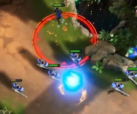
Also highlighted throughout the gameplay was the outline of a projectile after it was fired but before it lands:
This is again a nice visual cue; it makes you more aware of what’s going on.
Audio
I was happy to hear a heavy metal vibe to the background music, which I feel Blizzard moved away from after StarCraft II. I’m curious to learn who at Frost Giant is the driving force behind that; their website doesn’t yet list an audio lead.
Gameplay
I’m not able to offer a good opinion on the gameplay until I’ve spent at least a couple hundred hours with the game. My main observation is that Frost Giant chose to highlight a lot of combat mechanics, but not very many economic mechanics. Philosophically, that reminds me of StarCraft II.
Final Thoughts
I was impressed by today’s presentation. It’s pre-alpha footage, so it will likely change significantly between now and launch. But the directional details, like the durable art style, the vibrant environments, the approach to unit movement, and the graphical cues, make me feel more confident in the team’s long-term path. I’m looking forward to seeing what the final product looks like. For now, I recommend folks go and check out what Frost Giant put together for the PC Games Show.
Until next time,
brownbear
If you’d like, you can follow me on Twitter and Facebook and check out my YouTube and Twitch channels.


